Color for Fun and Profit
Tip
Question: What's wrong with this chart?
Answer: Many many things.
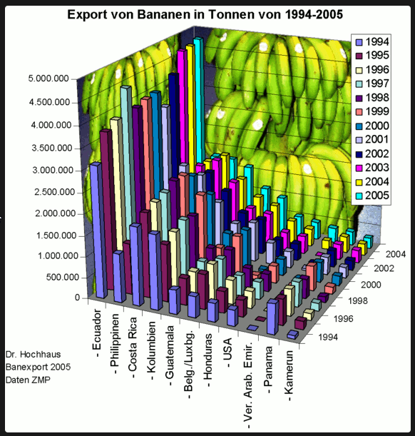
One of the main things, besides that it's completely unintelligible, is that it's has color, but it isn't using color.
When you have color it should have a purpose. The color should communicate something. If you're interested in other things like color, that aren't color (called pre-attentive attributes), there's a list in Story Telling with Data by Cole Knaflic. By far one of the best books on design for documents I've read.
Charts can be tricky part, but by reading that book I have something to reference when the project demands it.
The SWD reference is great for when you have a particular story to tell with a chart but what if you are just what if it is a tool you're working on, not a "story?" You’re not trying to point whoever is looking at this tool to a specific outcome.
Don't persuade, just be thoughtful about colors you're using.
What that could mean is if you’re doing a projections versus actual data table, then the headers should be shown different in different colors. If you are making a chart then put the projections in a light grey, you want to highlight that "these numbers are different."
But there should be some kind of decision making that is coming from a chart that you're making, otherwise, why are you doing it?
project highlight
again, nothing this time
unrelated reading
- Amazon WBR
- This weird looking excavator, please reach out if you have any idea what it's used for